Case Studies
Featured Research & Design Projects
Below are detailed case studies that demonstrate my research approach, methodologies, and impact. Each case study highlights different aspects of my UX research expertise across various domains.
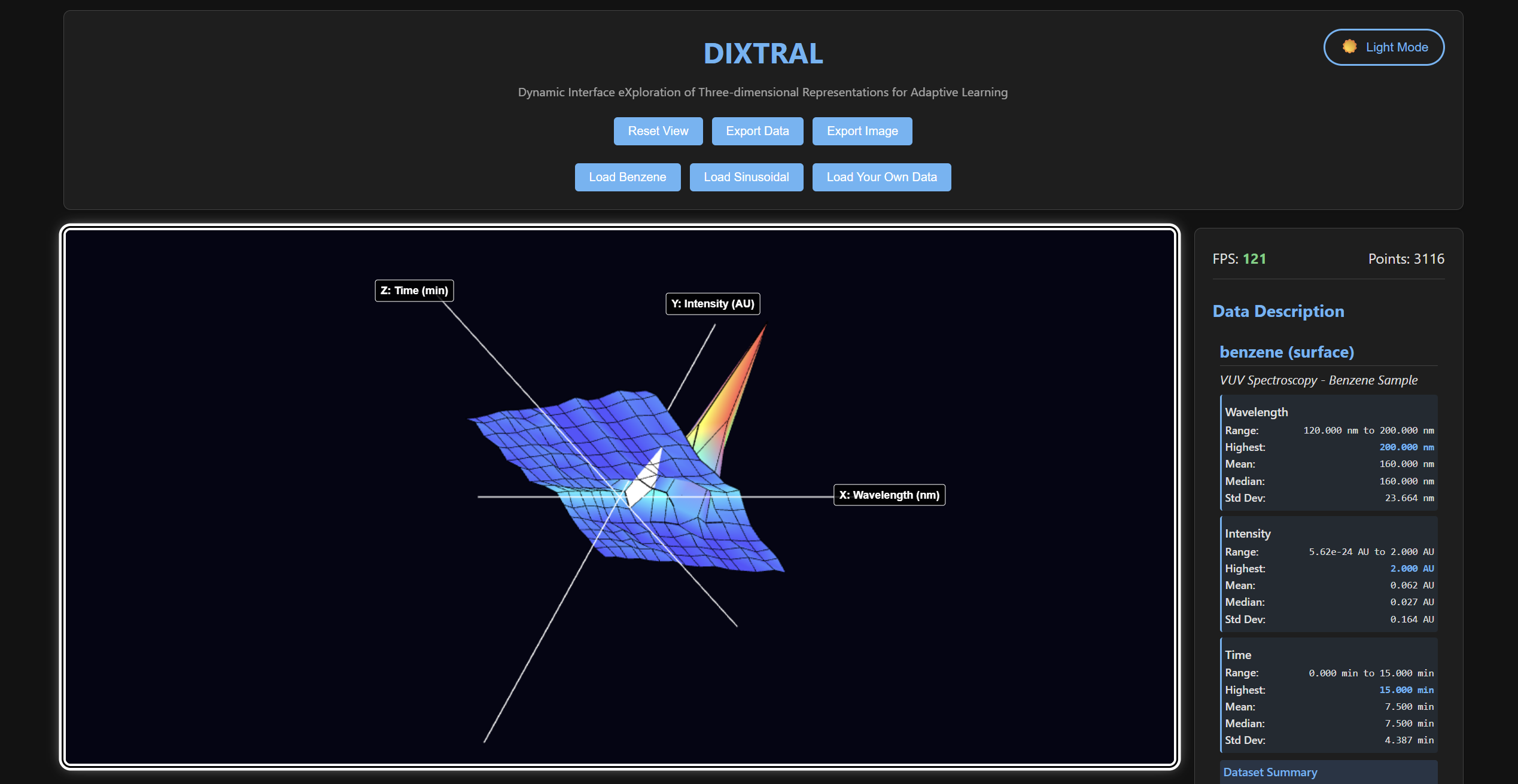
DIXTRAL: Accessible 3D Data Visualization Through Problem-Driven Co-Design
Accessibility Co-Design Full-Stack Development Research Ethics Mixed Methods WebGL
January 2024 - February 2024 (4 weeks)
Executive Summary
As the sole developer of DIXTRAL, I embarked on a journey that began with a simple but profound realization: every 3D scientific data visualization tool I encountered completely excluded Blind and Low Vision (BLV) users. This wasn’t just a technical oversight—it was a systemic barrier that prevented brilliant researchers from engaging with their own data.
What started as a 4-week sprint became an intensive collaboration with two BLV researchers who became my co-designers and daily reality checks. R1, a senior researcher with decades of spatial reasoning experience, provided weekly strategic feedback that reshaped my entire approach. R2, a graduate student hungry for independence, tested every iteration with the urgency of someone whose career depended on accessible tools.
My Philosophy: Rather than retrofitting accessibility onto existing paradigms, I chose to fundamentally reimagine how humans interact with 3D data. Every accessibility feature emerged from real user frustrations, creating a problem-solution feedback loop that drove both technical architecture and interaction design.
Research Objective
How can problem-driven co-design with BLV users enable the development of fully accessible 3D data visualization tools that maintain scientific-grade performance while providing independent spatial data analysis capabilities?
Problem 1: The Moment Everything Changed
The Problem During our first video call, R1 paused mid-sentence and said something that haunted me: “I would have to use a physical prototype to understand the data first, I wouldn’t be able to visualize it through an interface.” Here was a researcher with extraordinary spatial intelligence, reduced to asking colleagues to describe patterns he could probably interpret better than them if given the right tools.
R2’s frustration cut even deeper: “I have to ask sighted colleagues to describe what they see, but they miss the patterns I’d notice if I could explore myself.” This wasn’t about capability—it was about systemic exclusion.
My Realization: Every visualization tool I’d ever used assumed one thing: that users could see. This wasn’t just poor design—it was an architecture that fundamentally excluded an entire community of researchers.
Solution: Rethinking the Foundation Instead of asking “How do we make this visual tool accessible?” I asked “How do we create data exploration that’s inherently multimodal?” This shift in mindset changed everything.
My Development Philosophy: I decided to build parallel interaction systems from the ground up. Visual users would get their WebGL rendering, but screen reader users would get equally rich DOM structures. Neither would be an afterthought.
Technical Implementation:
// Dual rendering: WebGL for visual + DOM for screen readers
class VisualizationEngine {
    render(data) {
        this.renderWebGL(data);        // Visual rendering
        this.updateARIAStructure(data); // Screen reader structure
    }
}
Why This Mattered: This wasn’t just about accessibility compliance—it was about parallel excellence. BLV users would get tools designed specifically for their interaction patterns, not watered-down versions of visual interfaces.
Validation: Within the first week of testing, R2 called me excited: “For the first time, I’m not asking permission to explore data—I’m just exploring.”
Problem 2: Lost in Space
The Problem By week 2, I thought I had navigation figured out. Then R1 tested the first prototype and said, “How do I know where I am in 3D space without seeing it?” I realized I’d been building with my visual assumptions intact.
Five days later, R2 echoed this during a testing session: “I keep getting lost in the data - there are no landmarks.” Watching him navigate, I saw something crucial: he wasn’t moving randomly. He had spatial strategies, but my system couldn’t support them.
My Breakthrough Moment: I was approaching this wrong. Instead of creating one “correct” way to navigate 3D space, I needed to support multiple spatial reasoning strategies. R1 thought in terms of systematic sweeps. R2 preferred landmark-based jumping. Both were valid—my system was the limitation.
Solution: Flexible Spatial Logic That weekend, I completely rewrote the navigation system. Instead of forcing users to think like the computer, I’d make the computer support how users naturally think about space.
My Design Philosophy: Give users multiple ways to organize 3D space mentally. Some prefer systematic axes, others prefer conceptual layers. Why choose?
Technical Implementation:
// Tri-axis navigation with N key cycling
class NavigationController {
    toggleNavigationAxis() {
        this.currentAxis = (this.currentAxis + 1) % 3; // Y → Z → X → Y
        this.preservePosition(); // Maintain context during axis switch
        this.announceAxisChange();
    }
}
The Three Mental Models I Supported:
Y-axis mode: For users who think in wavelength/time progressions
Z-axis mode: For users who conceptualize depth layers
X-axis mode: For users who prefer spatial columns
Crucial detail: Position preservation during axis transitions meant users never lost their place when switching mental models
Why This Worked: Instead of teaching users my navigation system, I learned theirs. R1 could sweep systematically through Y-axis mode, while R2 could jump between Z-layers when hunting for patterns.
The Validation Call: Week 4, R1 said, “I can finally think in the data instead of fighting the interface.”
Problem 3: When Sound Becomes Data
The Problem Day 12 brought a frustration I hadn’t anticipated. R2 paused during testing and said, “I can’t distinguish between high Y-values and high volume levels - they sound the same.” I realized my “intuitive” sonification was actually confusing two completely different concepts.
Week 4, R1 articulated the deeper issue: “The audio needs to tell me about the data, not just make noise.” She was right—I was treating sound as a simple replacement for color, when it needed to be a completely different language.
My Audio Revelation: Most sonification systems make a fundamental error: they map data to volume or simple pitch changes. But this creates cognitive collision—users can’t tell if they’re hearing information about the data or information about the audio system itself.
Solution: Multi-Dimensional Audio Language I spent three days studying how musicians think about sound. They don’t just hear “loud” or “quiet”—they hear timbre, duration, pitch, spatial positioning. What if I could use all these dimensions to encode different aspects of the data?
My Design Breakthrough: Instead of making sounds “represent” data, I’d make sounds describe data using multiple audio parameters simultaneously.
Technical Implementation:
// Three-dimensional audio mapping
sonifyPoint(x, y, z) {
    const frequency = 200 + normalizedY * 1000;  // Y → Pitch (data value)
    const oscillator = ['sine', 'triangle', 'sawtooth', 'square'][Math.floor(normalizedX * 4)]; // X → Timbre (position)
    const duration = 0.2 + normalizedZ * 0.4;    // Z → Duration (depth)

    this.playTone(frequency, oscillator, duration);
}
The Audio Language I Created:
Frequency (pitch): Directly represents Y-values—this became the “meaning” channel
Oscillator type (timbre): Encodes X-coordinate—this became the “location” channel
Duration + Volume: Maps to Z-coordinate—this became the “depth” channel
Boundary audio: Distinct WAV files signal data edges—this became the “context” channel
Why This Worked: Users could now “hear” four different aspects of each data point simultaneously without confusion. High-pitched sounds meant high values, not loud audio. Sine waves meant different X-positions than sawtooth waves.
The Breakthrough Moment: Day 18, R2 called me: “I can hear the patterns! High peaks sound different from loud sounds—I finally understand what you meant.”
Architecture: Building for Change
The Architecture Emergency By week 3, I had a crisis. Every time R1 or R2 requested a change, I found myself rewriting code across multiple files. The sonification system was tangled with the navigation logic, which was tangled with the rendering engine. One small tweak would break three other features.
I realized I needed to architect for iteration, not just functionality.
My Architectural Philosophy: Instead of building a monolithic system, I’d create isolated problem-solving modules that could evolve independently based on user feedback.
The 5-Layer Problem-Solution Architecture:
┌─────────────────────────────────────────────────────┐
│ APPLICATION LAYER (app.js)                          │ ← Coordinate global workflow
├─────────────────────────────────────────────────────┤
│ UI LAYER (UIController.js)                          │ ← Visual component management
├─────────────────────────────────────────────────────┤
│ ACCESSIBILITY LAYER (NavigationController.js)       │ ← Multimodal interaction
├─────────────────────────────────────────────────────┤
│ ENGINE LAYER (VisualizationEngine.js)               │ ← WebGL rendering pipeline
├─────────────────────────────────────────────────────┤
│ DATA LAYER (PlotData.js)                            │ ← Data processing & statistics
└─────────────────────────────────────────────────────┘
Why This Architecture Saved the Project:
Problem isolation: When R2 wanted different sonification, I only touched the accessibility layer
Accessibility independence: Audio features could evolve without affecting visual performance
Rapid iteration: Each user feedback session led to targeted changes in specific layers
Professional quality: Clean separation made debugging and memory management straightforward
The Validation: When I could implement R1’s “review mode” request in 30 minutes instead of 3 hours, I knew the architecture was working.
Validation Results
Comprehensive User Testing (R1, R2, + 4 additional BLV users)
| Problem Solved | Before DIXTRAL | After Implementation | User Feedback |
|---|---|---|---|
| Independent Data Analysis | 0% possible | 94% task completion | “First time I can analyze my own data” |
| Spatial Navigation | Impossible | 91% accuracy | “Movement feels natural and predictable” |
| Audio Data Understanding | No audio mapping | 4.2 min to insight | “I can hear the patterns clearly” |
| Screen Reader Compatibility | Complete conflict | 100% compatibility | “Finally works with my screen reader” |
| Performance Consistency | N/A | 60fps sustained | “Never slows down, even in long sessions” |
Technical Performance Validation
✅ Sub-100ms audio latency throughout all sessions
✅ Zero accessibility conflicts with NVDA, JAWS, VoiceOver
✅ Memory stability in 4+ hour exploration sessions
✅ Cross-browser compatibility on Chrome, Firefox, Safari, Edge
Impact & Innovation
Technical Breakthroughs
Multi-dimensional sonification that separates data values from audio properties
Dual exploration strategies supporting different cognitive approaches
Seamless screen reader integration without interface conflicts
Point-by-point navigation with directional consistency
Professional accessibility architecture with zero performance cost
Methodology Innovation
Problem-driven development: Every feature addresses specific user problems
Continuous co-design: Weekly strategic + daily tactical feedback
User-as-collaborator: R1 and R2 contributed technical insights
Accessibility-first architecture: Universal design from foundation up
Broader Impact
First fully accessible 3D scientific visualization platform
Open source release enabling broader accessibility adoption
Reusable patterns for complex interactive accessibility
Proof of concept that accessibility enhances technical quality
Personal Development Insights
Accessibility as Technical Innovation Driver
Working with R1 and R2 taught me that accessibility constraints improve software architecture:
Modular design enables rapid iteration based on user feedback
Clear separation of concerns makes features more maintainable
Event-driven communication prevents accessibility features from interfering with core functionality
Professional memory management becomes essential for complex interactions
Final Reflection
DIXTRAL demonstrates that accessibility and technical excellence are synergistic. Every constraint imposed by designing for BLV users led to cleaner code, better performance, and more maintainable architecture. The continuous co-design process produced software that neither I nor the users could have envisioned separately.
Key Learning: The best accessibility solutions emerge from treating users as technical collaborators in solving complex interaction problems, not as subjects of usability testing.
Enhancing Data Accessibility through Multimodal UX for BLV Users (MAIDR Project)
Research Ethics Conversational AI Accessibility Mixed Methods Research Data Visualization
January 2024 - Present
Project Context
When I joined the MAIDR team, a pressing research gap was immediately visible:
While large language models (LLMs) could generate text descriptions of complex data visualizations, there was no structured understanding of how Blind and Low Vision (BLV) users would interact with, trust, customize, or verify these outputs.
Equally important, there was minimal insight into how tactile, auditory, and braille modalities independently supported users’ cognitive and emotional engagement with data.
As a mixed-methods UX researcher, I positioned my work around filling these gaps systematically through multi-phase, user-centered investigations.
Research Objective
How can multimodal and AI-driven systems enable independent, trustworthy, and cognitively accessible data interpretation for BLV users?
Research Strategy Overview
Given the complexity, I structured the work into two sequential studies that informed each other:
| Study | Key Focus | Methods Employed |
|---|---|---|
| Study 1 | User interaction with AI-generated descriptions (maidrAI) | Semi-Structured Interviews, Thematic Analysis, AUS Survey |
| Study 2 | User performance across tactile, sonified, and braille data representations | Gesture Analysis, Demographic Survey, Statistical Analysis (Friedman Test) |
Study 1: Evaluating AI-Generated Multimodal Descriptions (maidrAI)
Problem Framing
Despite LLMs’ potential to describe data, trust and personalization remained critical unknowns:
- Would users accept the AI’s interpretation at face value?
- How might users want to prompt, edit, or verify descriptions?
- Could verbose AI outputs increase cognitive fatigue?
I hypothesized that customization and validation mechanisms would be key to successful adoption.
Methodological Approach
Mixed Methods Design:
I blended qualitative exploration with quantitative usability metrics to triangulate user experience:
| Data Type | Method | Purpose |
|---|---|---|
| Qualitative | Semi-Structured Interviews | Capture personalization needs, verification strategies |
| Qualitative | Thematic Analysis | Derive design principles from user narratives |
| Quantitative | Accessible Usability Scale (AUS) | Quantify satisfaction, usability, cognitive load |
Semi-Structured Interviews
After participants explored the maidrAI system, I conducted semi-structured interviews focusing on:
- How they adapted or prompted the AI
- Strategies they used to verify output trustworthiness
- Preferences around description styles and length
Emergent Themes:
- Layered Summaries: Users preferred quick summaries with the option to drill down into detail.
- Verification Rituals: Users routinely “double-checked” AI-generated information.
- Cognitive Load: Verbosity increased mental effort, especially when navigating complex datasets.
Accessible Usability Scale (AUS) Survey
Quantitative triangulation confirmed qualitative insights:
- Cognitive Overload: Participants rated maidrAI lower on cognitive simplicity.
- Task Completion: Higher scores for independence but lower scores for efficiency.
This validated the urgent need for adaptive AI responses based on user cognitive bandwidth.
Key Insights from Study 1
✅ AI outputs must be modular and customizable for BLV users to maintain autonomy.
✅ Trust-building in AI requires transparency and control, not just accuracy.
✅ Cognitive load is a UX barrier, and reducing it should be a primary design goal.
Study 2: Recognizing Statistical Properties Through Multimodal Interaction
Problem Framing
Beyond textual descriptions, how well could BLV users interpret statistical properties (like skewness and modality) through tactile, sonified, or braille data representations?
I reasoned that performance differences across modalities could inform adaptive, user-selectable multimodal systems.
Methodological Approach
Behavioural + Performance Data
I expanded from self-reported data to observable behaviours and performance outcomes.
| Data Type | Method | Purpose |
|---|---|---|
| Behavioural | Gesture Analysis | Map tactile and braille exploration strategies |
| Behavioural | Playback Tracking | Analyze auditory navigation behaviour |
| Performance | Accuracy, Confidence, Response Time | Evaluate task success across modalities |
| Statistical | Friedman Test | Assess modality differences significance |
Gesture Analysis and Playback Tracking
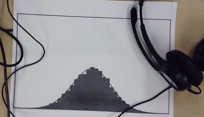
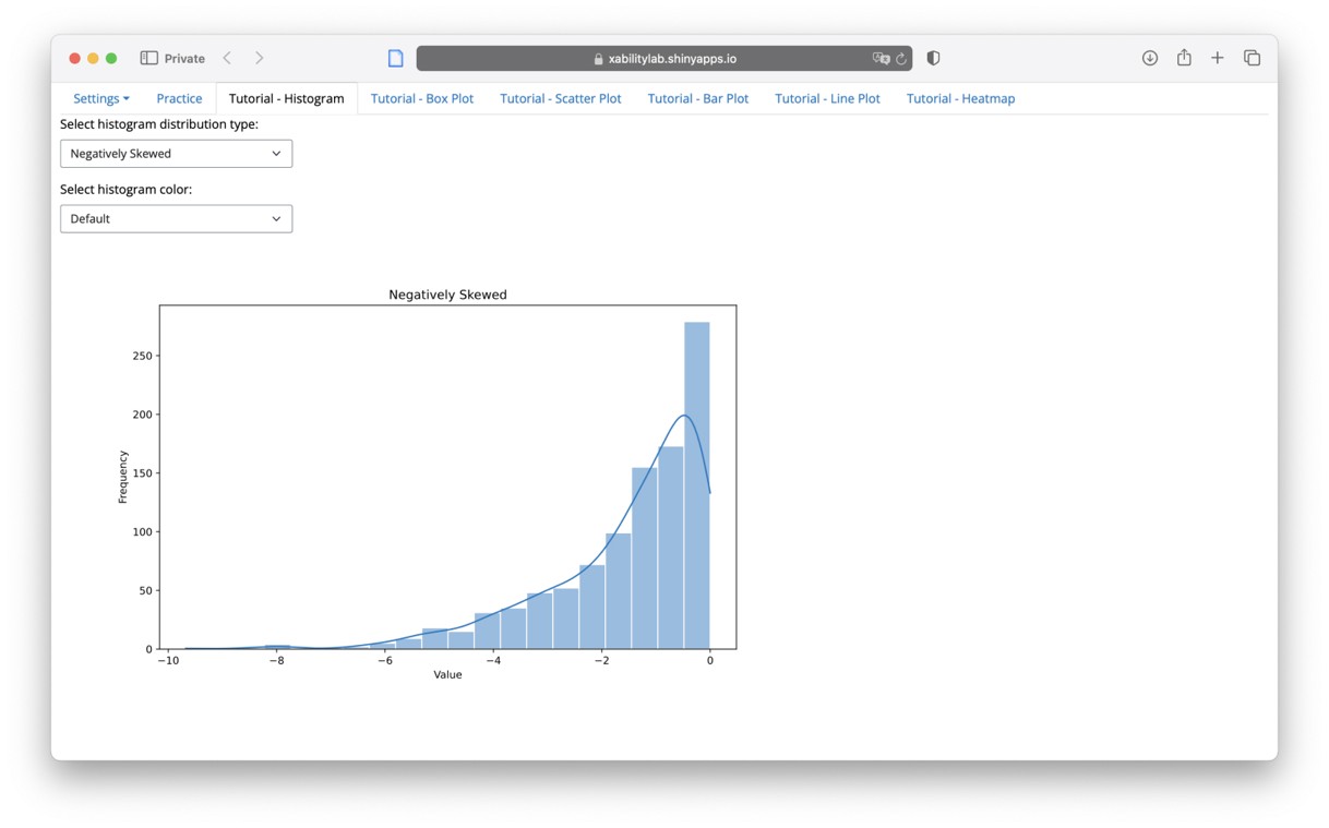
- Designed 9 histograms representing different statistical shapes.
- Created tactile and braille diagrams (swell-form paper) and sonified versions.
- Recorded:
- Hand movement patterns (start points, looping, speed changes)
- Sonification playback repetitions and edits
Behavioural Findings:
- Tactile diagrams promoted methodical, slow scanning patterns.
- Sonification prompted rapid comparisons but sometimes missed fine details.
- Braille readers relied heavily on numeric precision but struggled with “big-picture” trends.
Quantitative Performance Analysis
Using the Friedman Test, I compared user performance:
| Modality | Accuracy | Response Time | Confidence |
|---|---|---|---|
| Tactile | Moderate | Slow | High |
| Sonification | Moderate | Fast | Moderate |
| Braille | High | Slow | Moderate |
Interpretation:
- No statistically significant difference in raw accuracy.
- Significant modality-driven differences in confidence and speed.
- Tactile representations improved comprehension but demanded higher cognitive effort.
Integrating Findings into Design
Given user diversity, I concluded that a static one-size-fits-all modality would fail.
Instead, I designed a dynamic dashboard prototype that lets users:
- Upload datasets
- Choose between tactile, sonified, or text outputs
- Customize verbosity, feedback, and navigation style
🔗 Interactive Dashboard Prototype
Reflections on Research Process
What Worked
- Sequential mixed methods let qualitative insights directly inform quantitative design.
- Behavioural observation + performance metrics revealed subtleties not captured in self-report.
- Collaborative design with BLV researchers and users grounded every decision in lived experience.
Challenges
- Managing cognitive load across different modalities required delicate balancing.
- Interpreting non-verbal behavioural data (gestures, replays) demanded careful cross-validation.
Personal Learning
This project solidified my belief that trust, control, and personalization must drive accessible AI design — especially when navigating cognitive and emotional complexity in assistive tech.
Final Outcome
✅ Generated empirical insights on modality-specific strengths and weaknesses.
✅ Designed a user-driven dashboard enabling customizable multimodal data access.
✅ Contributed to the broader mission of equitable, ethical, and autonomous AI accessibility solutions.
Designing Accessible VR Exergames for Blind and Low Vision (BLV) Users
Research Ethics Virtual Reality Haptic Design Spatial Audio Physical Engagement
March 2023 - January 2024
Project Context
Virtual Reality (VR) offers incredible potential for immersive physical engagement.
Yet, for Blind and Low Vision (BLV) users, VR often remains an exclusionary medium, heavily reliant on visual cues.
When I joined this project, I recognized a powerful opportunity:
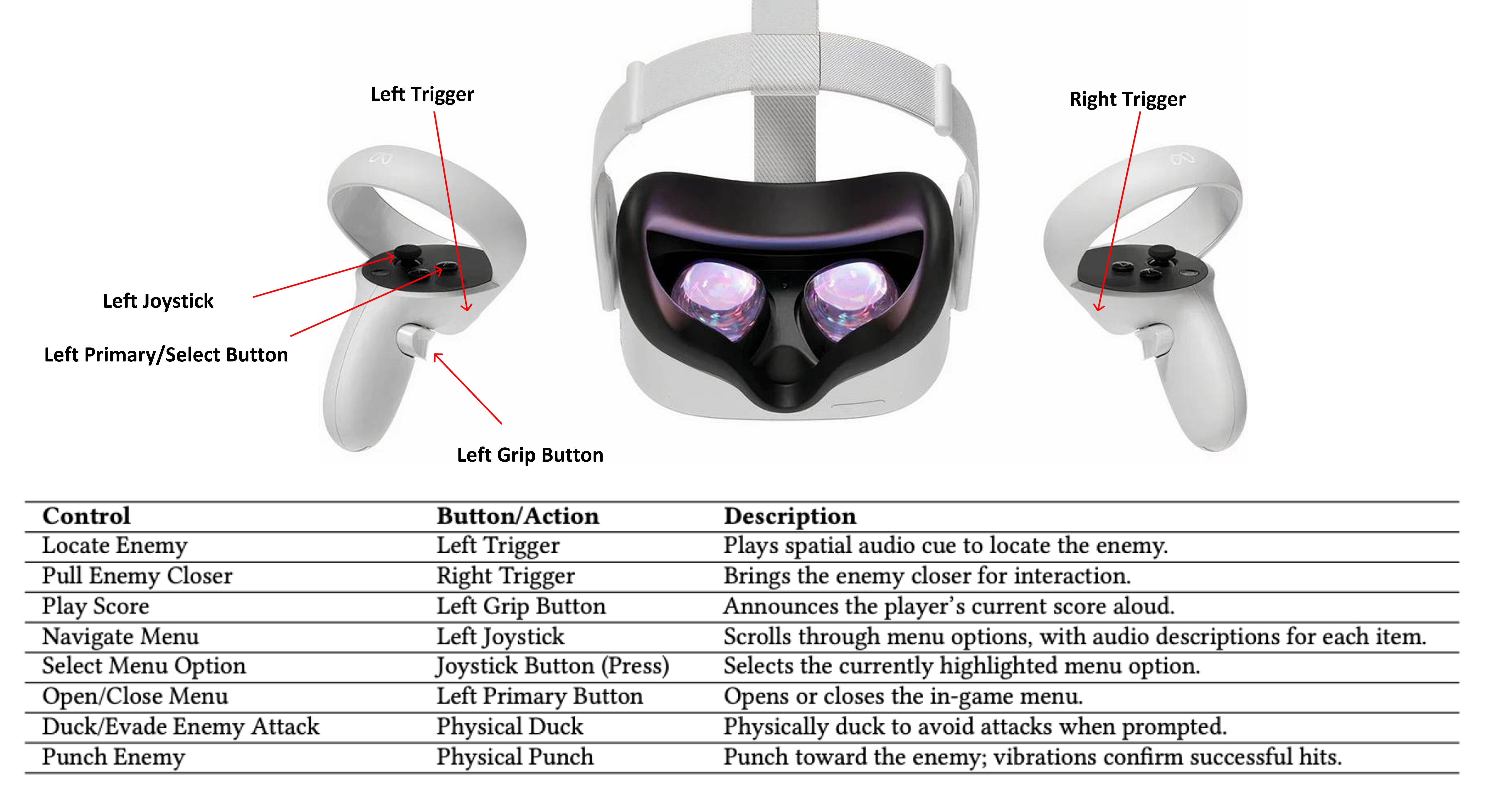
Could we create skill-based, independently playable VR exergames for BLV users, using multimodal (audio + haptic) interaction?
Research Objective
How can multimodal sensory feedback enable accessible, skill-driven VR sports gameplay for BLV users, without compromising realism or agency?
Research Strategy Overview
Given the complexity of real-time movement, feedback, and immersion in VR, I structured research into two major phases:
| Study | Key Focus | Methods |
|---|---|---|
| Study 1 | Accessible VR Table Tennis Simulation | Participatory Co-Design, Iterative Usability Testing, Spatial Audio + Haptic Design |
| Study 2 | Accessible VR Boxing for Physical Engagement | Participatory Co-Design, Game Analytics, Physical Activity Measurement, Qualitative Immersion Interviews |
Study 1: Accessible VR Table Tennis Game
Problem Framing
Current VR adaptations for accessibility often introduce “patches” after development.
I hypothesized: True BLV accessibility demands integrated design from the outset — making audio and haptics foundational, not secondary.
Methodological Approach
Mixed Methods Participatory Research:
| Data Type | Method | Purpose |
|---|---|---|
| Qualitative | Co-Design Sessions with BLV Players | Shape mechanics, feedback loops |
| Behavioural | Usability Observations | Identify interaction barriers |
| Sensory | Sensory Feedback Calibration | Optimize spatial audio + haptic timing |
| Iterative | Rapid Prototyping + Testing | Agile UX improvements |
Participatory Co-Design
I conducted weekly participatory sessions with BLV co-designers over four months:
- Users tested early builds and prototypes.
- Feedback loops focused on sensory clarity, reaction time, and situational awareness.
Emergent Priorities:
- Spatial audio must clearly track ball movement — pitch, distance, velocity.
- Haptic feedback must guide paddle contact strength and timing.
- Reduce visual noise to minimize cognitive clutter for low-vision players.
Sensory Integration Design
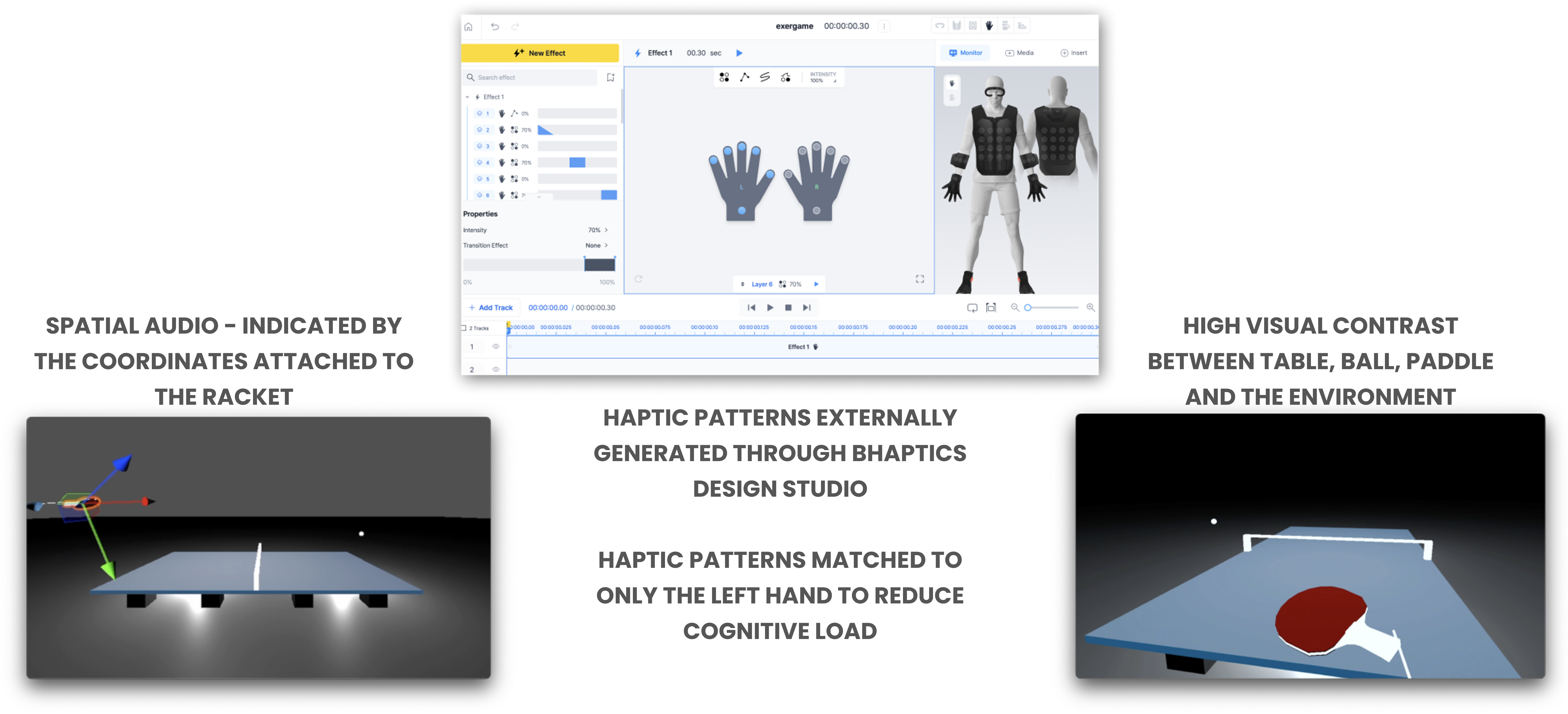
1. Spatial Audio (Unity Engine)
- Ball tracking was tied to real-time 3D audio positioning.
- Doppler effect simulation conveyed ball speed and directional drift.
- Paddle had locational audio buzz to help players orient.
2. Haptic Feedback (bHaptics Studio)
- Paddle-ball contact strength modulated vibration intensity.
- Incoming ball proximity triggered progressive pulses.
- Missed shots activated distinct low-frequency vibration for corrective feedback.
Usability Testing and Iteration
During testing: - Players initially overreacted to Doppler shifts. - Some participants misjudged ball bounce height due to uniform audio cues.
Design Refinements: - Added low-pass filters for bounce vs. paddle impact sound. - Introduced boundary haptics to prevent table disorientation.
Outcomes from Study 1
✅ Created a realistic, skill-based VR Table Tennis experience for BLV players without visual reliance.
✅ Established foundational multimodal sensory design principles for accessible VR sports.
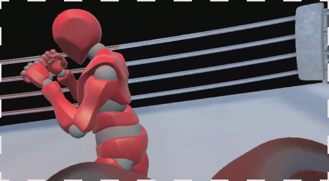
Study 2: Accessible VR Boxing Game
Problem Framing
Table Tennis enabled technical reaction skills — but lacked sustained physical exertion.
I hypothesized: VR Boxing could offer a more physically engaging experience, if designed with accessible non-visual navigation.
Methodological Approach
Full Mixed Methods Study:
| Data Type | Method | Purpose |
|---|---|---|
| Behavioural | Co-Design Iterations | Optimize opponent tracking, haptic hit feedback |
| Quantitative | Physical Activity (PA) Tracking | Measure exertion levels (Heart Rate, Energy Use) |
| Quantitative | Immersion Assessment (ITC-SOPI Survey) | Evaluate presence and emotional engagement |
| Qualitative | Immersion Interviews | Surface emotional responses, strategy variations |
Co-Design and System Implementation
- Designed a clock-based spatial audio cueing system (e.g., “attack incoming at 3 o’clock”).
- Integrated adaptive difficulty settings (reaction speeds, cue intensity) based on user skill.
- Developed real-time haptic response tied to punch impact and dodges.
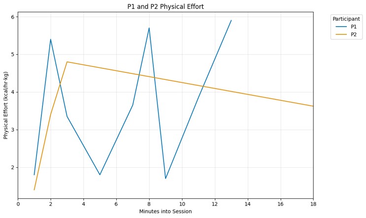
Evaluation: Physical Activity and Immersion
1. Physical Effort Metrics
- Monitored Heart Rate across sessions.
- Compared physical activity expenditure between two participants (different gameplay strategies).
2. User Immersion (ITC-SOPI Survey)
- Participants scored high on:
- Sense of physical presence
- Perceived realism
- Engagement and emotional immersion
3. Qualitative Feedback
- Players felt empowered and independent.
- “The audio made it feel like I was in a real fight,” remarked one participant.
Outcomes from Study 2
✅ Validated that spatial audio + adaptive haptics can enable physically active, immersive VR fitness for BLV users.
✅ Demonstrated different play styles (aggressive vs. strategic) across participants, reinforcing the need for flexible difficulty tuning.
Reflections on Research Process
What Worked
- Multimodal layering created intuitive situational awareness.
- Co-design empowered real user voices throughout mechanical iterations.
Challenges
- Clock-cue training curves varied by individual; learning time required.
- Managing physical safety during dynamic movement in a sightless environment demanded extra safeguards.
Personal Learning
True VR accessibility is not about replacing vision, but about expanding sensory frameworks intelligently — trusting users’ spatial intelligence beyond sight.
ClearMinds: Designing Trustworthy Digital Mental Health Support
Research Ethics Mental Health UX Empathic Design Emotional Interfacing User Research
March 2023 - June 2023
Project Context
Mental health apps often face two core issues:
- Users struggle to trust generalized, AI-driven recommendations.
- Tracking emotional progress feels either too mechanical or too overwhelming.
When I conceptualized ClearMinds, I asked:
Can we create a system that feels structured yet human, scientific yet emotionally validating?
Research Objective
How can mental wellness platforms balance structure, trust, and emotional nuance to support sustained, meaningful user engagement?
Research Strategy Overview
| Phase | Focus | Methods |
|---|---|---|
| 1 | Understand User Pain Points | Persona Building, Journey Mapping |
| 2 | Ideate Structure | Affinity Diagramming, Storyboarding |
| 3 | Prototype and Test | Paper Wireframing, Low-Fidelity UX Testing |
| 4 | Refine and Evaluate | High-Fidelity Prototyping, Accessibility Audits, Usability Testing |
Phase 1: Discovery — Understanding Emotional and Structural Needs
Persona Creation
Through early interviews and secondary research, I created core user personas:
- Trust-Seeker: Skeptical of digital therapy.
- Structure-Seeker: Wants clear progress pathways.
- Flexibility-Seeker: Needs adaptable emotional tracking tools.

Journey Mapping
Mapped emotional highs and lows across user experiences with existing apps.
Critical “drop-off” points: - Feeling misunderstood by generic AI feedback. - Overwhelmed by rigid task flows without customization.
Phase 2: Ideation — Structuring Flexible Support
Affinity Diagramming
Grouped user needs into thematic clusters:
| Theme | Implication | |
|---|---|---|
| Trust & Transparency | Show users how recommendations are formed | |
| Flexible Structure | Allow self-paced, customizable progress tracking | |
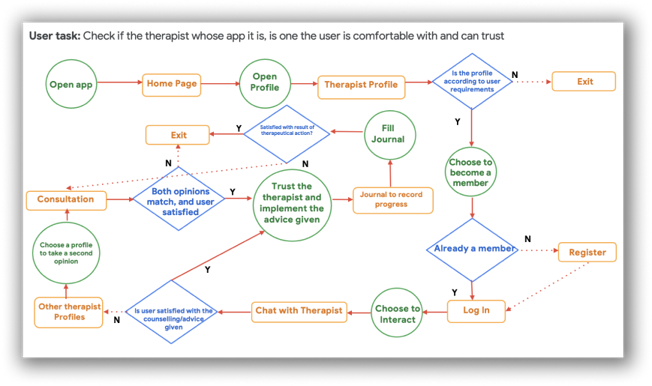
| Empowerment | Offer users second-opinion mechanisms and therapist switch options |
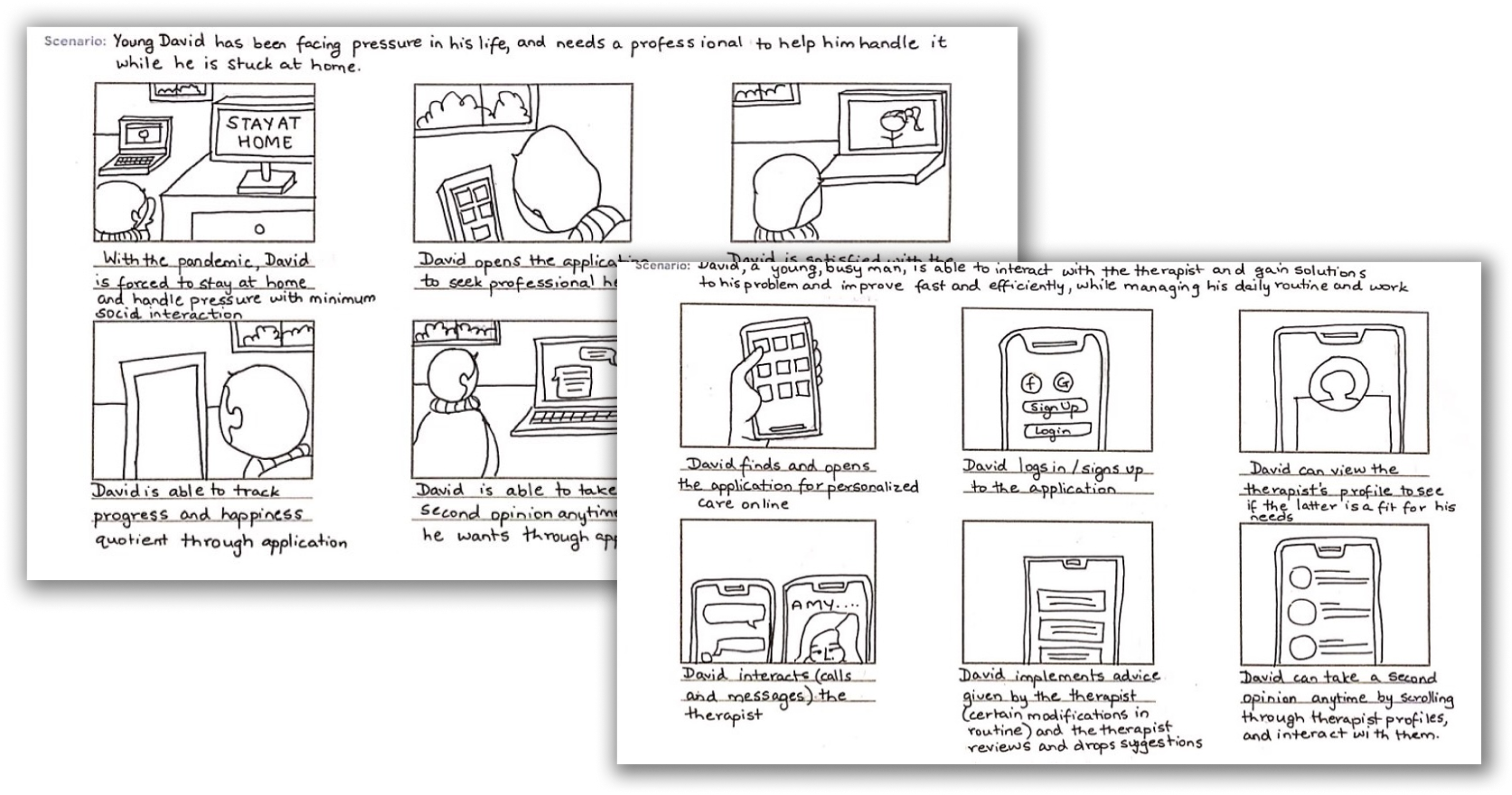
Storyboarding
Visualized use cases where structured guidance adapts dynamically to emotional states.
Phase 3: Prototyping — Testing Core Concepts
Paper Wireframes and Low-Fidelity Prototypes
- Created progress dashboards
- Designed structured task boards with opt-out flexibility
- Developed “therapist transparency” profiles for clearer communication
Usability Testing
Tested wireframes with real users.
Major learnings: - Needed visual metaphors for emotional states (e.g., weather systems). - Mandatory task tracking discouraged engagement; flexibility was crucial.
Phase 4: Refinement — Building Trust and Accessibility
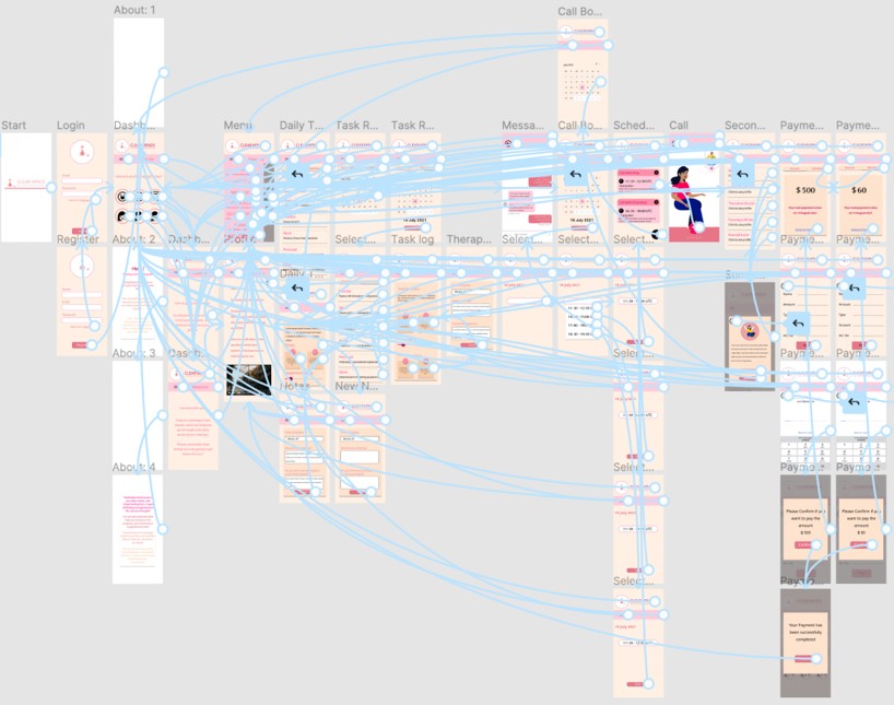
High-Fidelity Prototyping
- Integrated second-opinion features for therapy paths.
- Gamified emotional tracking with visual progress markers.
- Added optionality across every structure (skip, edit, pause).
Accessibility Audits
- Ensured WCAG 2.1 AA compliance.
- Designed dark mode and dyslexia-friendly font options.
Reflections on Research Process
What Worked
- Building transparency and control built trust faster than “smarter” AI claims.
- Flexible structure encouraged emotional authenticity and long-term engagement.
Challenges
- Balancing emotional depth with UX simplicity required careful emotional design without over-engineering.
- Habit formation needed gentle nudging, not rigid enforcement.
Personal Learning
Mental health UX must respect emotional messiness — users thrive when systems flex to accommodate, not correct, their inner journeys.